The good news? You can predict how – thanks to behavioral economist Dan Ariely.

No one understands human nature like Dan. He’s also super prolific, with 3 NYT best-sellers and the 2008 Ig Nobel prize in medicine.
5 ways to use his lessons to your advantage as a founder or leader…
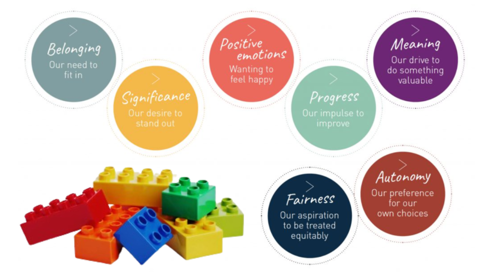
1) Motivated by meaning, not money.
Meaning can come from many things: creation, challenge, ownership, connection.
Take this example: a study paid people to build Lego models, but for one group they destroyed the models as soon as they were done. Motivation dropped much more quickly in this group, and even though they were offered the same $ per model, they stopped participating a lot sooner.
Interestingly, this trend was just as clear in participants who had a strong pre-existing interest in Lego. That shows just how soul-crushing a lack of meaning can be. Regardless of how interested someone is in your product, they still need to experience something meaningful if they’re going to stay motivated.
Giving your users substance and value is more important than a bargain.
2) Default to the default.
People hate making decisions, especially difficult ones.
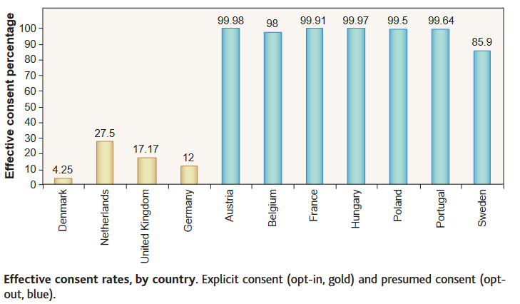
You might think it’s culture or religion that determines organ donation. But it’s actually the difference between opt-in and opt-out defaults. When countries make organ donation the default (ie opt-out), numbers sky-rocket. People go with the default because they don’t want to make the decision.
So, if you want people to subscribe to your emails? Make it an opt-out check box.
Don’t be afraid to set your preferred outcome as the default.
3) Add a bad option.
It might seem counter-intuitive, but adding a similar but worse version of your product or service can actually show off just how great the original version is.
Check out this study of physical attraction:
If the option is between Tom, Jerry, and ‘Distorted Tom’, original Tom looks even better by comparison and becomes much more appealing than Jerry. The same happens the other way round, too.

Basically, if you have two similar options, it actually makes the preferable one look even better.
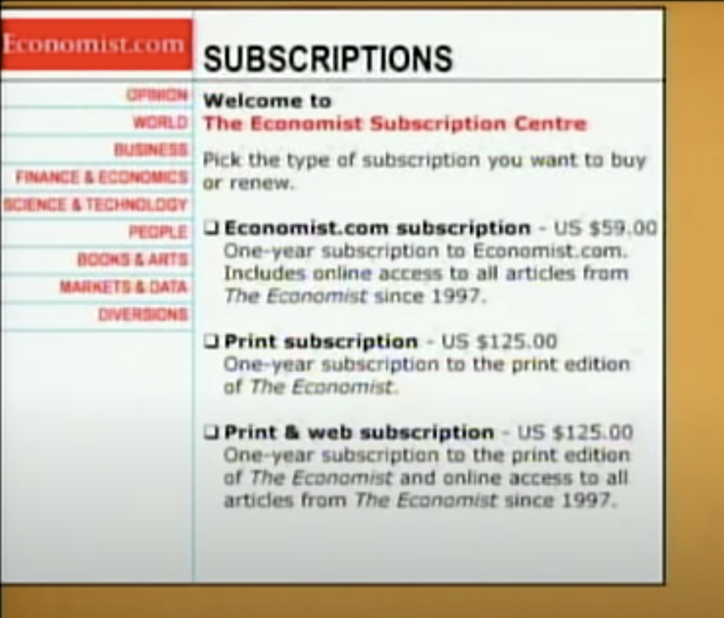
It’s really handy if you want to show off just how much value-for-money a premium option offers. Adding a second pricey option highlights just how good of a deal your original option is – like in this Economist offer.
The “Print” and “Print & web subscription” prices are the same, making the latter seem like a bargain by comparison.
4) Never ‘rip off the bandaid’
Despite conventional wisdom, we’re actually much better at tolerating pain (including psychological) in smaller doses over longer periods of time.
You might be tempted to make your users go through all the agonizing setup and meticulous admin straight away, to ‘get it over with.’ But we don’t cope well with this kind of intense, short-term frustration.
So if you have to make your user do something annoying, never bombard them with it all at once.
5) Let them build it themselves
You’ve probably experienced the IKEA effect yourself – we value things more when we’re involved in making them. We often have a heightened sense of attachment to IKEA furniture because we’ve played a role in building it.
Personalization options in design and user experience make folks feel invested in your product, even if they’re not overly substantial.





Alright, 51betbr. Nothing crazy special, but reliable and consistent. Sometimes that’s what you need, you know? Check it out 51betbr.
Alright, jogodotigre777… names a mouthful but the games look fun. Don’t get lost in the jungle and pace yourself. jogodotigre777
Is555lucky? Let me tell ya, it might just be! I had a rough day, but this site totally turned it around. Feeling pretty fortunate right now. Check out is555lucky and see if your luck changes too!